 |
| Auto Range SWR Example |
cialog Graph Basics
The cialog window can be resized. There is a minimum size limit, where graphing will be disabled because there is not enough area for drawing a graph with labels and legends. If a graph is visible with the window is being resized, the graph will be dynamically resized to fit the window.
The size of the graphing area, in pixels, is displayed on the statusbar. This information can be used to reproduce graphing areas with the same size at some future time.
cialog can display up to nine different data traces. Some of the data is measured by the CIA-HF, and then uploaded to cialog. The remainder of the data is calculated from measured data. The nine data traces are:
| cialog Data Traces | ||
| Name(s) | Measured/Computed | Description |
| SWR, S | measured | SWR measured at the CIA-HF |
| Resistance, R | measured | Resistance measured at the CIA-HF |
| Reactance, X | measured | Reactance measured at the CIA-HF |
| Impedance, Z | measured | Impedance measured at the CIA-HF |
| SWR @ Load, Sl | computed | SWR computed at the load side of a feed system |
| R @ Load, Rl | computed | Resistance computed at the load side of a feed system |
| X @ Load, Xl | computed | Reactance computed at the load side of a feed system |
| Z @ Load, Zl | computed | Impedance computed at the load side of a feed system |
| dB Loss, dB | computed | dB loss through the feed system |
With one exception, all of the computed data is only available when a feed system is in use. The exception is Z, or impedance measured at the CIA-HF. If Z is not uploaded, but R and X are, then cialog will compute Z, since it is the square root of the sum of the squares of R and X.
The Graph->Data Displayed On Graph popup menu is used to specify what traces should be displayed. Note: trace display is entirely different than data capture. It it impossible to display trace data which was not captured or calculated. On the other hand, just because trace data was captured or calculated does not mean that it must be displayed. The display control is what is handled with the Graph menu commands.
When operating in Single Data Set Mode, the menu commands have checkmarks next to each trace which should be displayed. More than one, in fact up to nine, commands can have checkmarks, signifying that all possible data should be displayed. When operating in Multiple Data Set Mode, the menu commands are treated as a set of radio buttons, where only a single trace type may be selected. This corresponds to the single trace data type which is being displayed across the multiple data sets.
When cialog is displaying a single set of data, obtained from a single CIA-HF capture, it is operating in Single Data Set Mode. In this mode, each trace represents a different one of the nine possible data categories described in the previous section. Traces within the same data set are graphed against other traces from the same data set.
Multiple Data Set Mode means that more than one data set is loaded in cialog. The data sets are either the single most recent capture and/or previously saved data files. When cialog is in Multiple Data Set Mode, only one of the nine possible data traces can be graphed at a time. In this case, however, that trace is graphed from each of the data sets.
Single Data Set Mode means that more than one data trace can be graphed on one graph from a single data set. Multiple Data Set Mode means that only one data trace type can be displayed on a single graph, but each data set provides a separate trace. What can't be done in this version of cialog is to graph more than one data trace type and more than one data set at the same time. It's either multiple traces from one file, or one trace from multiple files.
When graphing in Multiple Data Set Mode, it is a requirement that a frequency overlap exist between all data sets. In fact, the graph frequency range in Multiple Data Set Mode is defined to be the common frequency range across all data sets. If there is no overlap, then a graph cannot be drawn, and an error message will be displayed.
While it is possible to compare data which came from different frequency ranges (so long as there is overlap) and different sample widths, the best results will be obtained when the frequency range and sample width are the same between multiple data sets. This forces all sample points to share the same frequency points. cialog performs linear interpolation between sample data points when it is necessary to map data to a new frequency range to support Multiple Data Set Mode.
If you want to compare data between two or more captures, the data should be saved into files as it was captured. Use the Comment command to add descriptive text to the data if that helps keep the file contents organized. When you are ready to view the comparison, erase the graph, then begin opening all of the files that are part of the comparison. They will be accumulated on the graph as they are opened.
In order to make captured, but not saved, data part of the comparison, you must perform the capture first, since all captures have an implied erase, which removes all previous data sets. After the capture, it is then possible to open files and compare them against each other, as well as the captured data.
cialog can display data in three different categories, each with different measurement units. The units are SWR, Ohms, and dB. The data displayed on the graph will control how the graph is labeled on the left and right vertical axes. The horizontal axis is always the frequency axis.
If only one category of data is displayed, such as SWR data, then both left and right axes will indicate the SWR range. If two categories of data are graphed, then each data category will be assigned either the left or right vertical axes label. In the case of displaying all three categories of data, there is a problem, since there are only two sides to the graph. In that case, the dB Loss axis and labels will not be shown, and the left and right axes will be labeled with Ohms and SWR.
The data ranges for SWR, Ohms, and dB are selectable. Each category has an automatic range setting, where the extremes of the data set the axis range. In addition to the automatic range, there are number of predefined ranges. The Graph popup menu is used to access the range selections.
The function keys, F2, F3, and F4 are also used to select ranges. F2 cycles through the SWR ranges. F3 cycles through the Ohms ranges, and F4 cycles through the dB ranges.
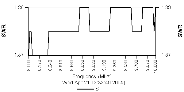
The range selection can have a large impact on the visual data presentation. If the range becomes too narrow, it is possible to see digital artifacts on the underlying CIA-HF data. Here is an example. A 25 Ohm resistor was connected to the CIA-HF. It should present a constant SWR of 2.0. cialog captured a data sweep of the load from 8 to 10 MHz. Here is the resulting graph, with the SWR range set to auto.
|
|
| Auto Range SWR Example |
At first blush, something looks broken. How can this be a graph of SWR? Well, it all becomes clear when you understand the vertical axis range. Because auto ranging is in use, the whole vertical axis varies from an SWR of 1.87 to 1.89. This is a very small range. In this narrow range, we can see the CIA-HF step between two discrete values, due to the digital portion of the instrument. Here is the same data, but now the SWR range has been set to 2.0.
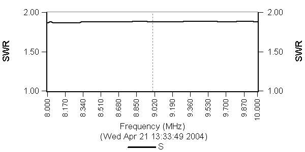 |
| Fixed Range SWR Example |
With an SWR range of 2.0, the graph immediately looks much more reasonable, although a little of the digital artifact can still be seen.
Although the user of cialog selects the axis ranges, the number and value of the marking labels is handled automatically by cialog. The implemented algorithm attempts to maintain a reasonable label density on the axis, and it has an affinity for certain round values. If you want to change the labels on an axis, resize the window, so that the length of the axis changes, which will cause an update in the label drawing algorithm.
A number of reference lines can be drawn on the graph. These reference lines are drawn as light gray dotted lines. A reference line is enabled by checking a menu command on the Graph->Reference Lines popup menu. A reference line will only be shown when data related to the line is visible. For example, if the SWR 2.0 reference line is selected, then that line will be shown only when SWR is being displayed on the graph. Here is a list of the reference lines available.
| Reference Lines | |
| Line | Description |
| Clear All Lines | All reference lines are removed |
| 2:1 SWR | A horizontal line is drawn at an SWR value of 2:1. |
| 3:1 SWR | A horizontal line is drawn at an SWR value of 3:1. |
| 0 Ohms | A horizontal line is drawn at an Ohms value of 0. |
| 50 Ohms | A horizontal line is drawn at an Ohms value of 50. |
| Center Frequency | A vertical line is drawn at the center frequency of the graph. |
| Resonance (X = 0) | A vertical line is drawn at each point where the reactance crosses zero. |
| Amateur Band LImits | A vertical line is dawn at each band edge (USA allocation) |
The reference line data value must also exist on the graph before the line is drawn. If the Ohms range of a graph is -30 to 30 Ohms, for example, then the 50 Ohm reference line will not be drawn since it does not lie within the visible graph range.
Here is an example graph which includes several reference lines.
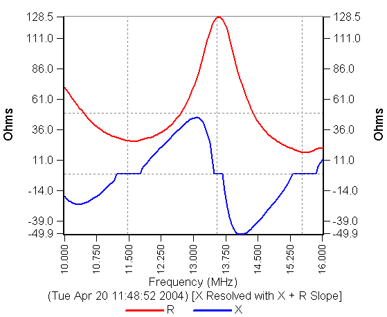 |
| Reference Line Example |
The graph includes horizontal reference lines at 0 and 50 Ohms, and vertical reference lines at points of resonance (reactance equals zero).
By default, reference lines are not labeled. They can be labeled through the Add Labels to Lines menu command on the Graph->Reference Lines popup menu. Each line will be labeled on the ends of the line with the gray color used on the reference line itself. Labels cannot be selectively applied. Either all reference lines are labeled, or none are.
The font used to draw the text around the graph, and the pens used draw the traces, can be set to one of three predefined sizes, smaller, medium, or larger. In this version of cialog, the font face is fixed at Arial.
Each graph can have a title string which appears at the top of the graph. The title is created and changed with the Add/Change Title Dialog Box. The title is not saved with the data, it is considered to be part of the graph. If you want to save a text string with the data, use a comment.
Once the title is set, it will remain at the top of all graphs until it is changed. The title is not saved when cialog terminates.
The menu command Graph->Select Trace Pens displays the Pen Color Chooser Dialog Box. This dialog is used to select the pen color and styles for drawing traces. The pens are grouped into two categories. The first is pens for Single Trace Mode, and the second is pens for Multiple Trace Mode. Within each mode, there are two further groupings. There are selections for color drawing, and selections for black and white drawing. Here is an example screen capture of the dialog box.
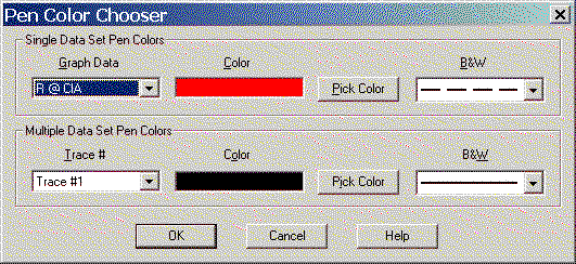 |
| Pen Color Chooser Dialog Box |
The top row of controls, in the Single Data Set Pen Colors group box, affect the pens used in Single Data Set Mode. The bottom row are used with Multiple Data Set Mode.
To use the dialog, first select the desired data or trace number from the drop down controls on the left. In this example, the resistance at the CIA (R @ CIA) is selected. The remaining controls to the right of the selection describe the drawing pen characteristics of that selection. In the case of the resistance, the color pen choice is red, and when a graph is drawn in black and white, the pen style for resistance at the CIA-HF is a dashed line. If you want to change the color of a selected trace, click the Pick Color button to display the system color chooser dialog. The black and white pen style is selected with the drop down control on the right. Pick the desired style for the selected trace.
cialog supports black and white, as well as color drawing. When drawing in black and white, traces are differentiated by their pen style, such as a solid line, or a dashed line. There are far fewer pen styles than pen colors. All of the available Windows pen styles have been provided as choices.
Whenever a graph is drawn, cialog will examine the characteristics of the output device. Some output devices, such as a laser printer, offer only black and white output. When the device is only capable of black and white output, the drawing will be made in black and white. The pen styles can be selected with the Pen Color Chooser Dialog Box.
If the output device supports both color as well as black and white drawing, then the mode chosen is based upon the user's selection on the Graph menu.
The comment is a text string which is saved along with the captured data. It is a small message which is associated with the data. If the comment string is present, it will be displayed on the graph. A comment can only be added at the time of data capture.
Adding/changing the comment string does not cause an automatic update of the saved data file. If you change the comment after saving captured data, you must save the file again so that the modified comment is saved.
This menu command causes the contents of the main window to be placed on the system clipboard. From the clipboard, the contents can be pasted into other programs, such as a paint program, or a word processing program. The sky's the limit.
The size of the main window drawing area is shown in the second from the left region of the statusbar. The size is measured in units of pixels. The size information can be used to construct desired graph sizes, usually to create repeatable results between different measurement sessions.
When the mouse is moved over a data graph, the cursor is changed from the normal representation to a crosshair form. When the crosshair is visible, the left-most statusbar region describes the data located under the center of the crosshair. The data reported in the statusbar is a function of the data displayed on the graph. The data can consist of Frequency, SWR, Ohms (resistance, reactance, impedance), and dB loss fields.
The Graph->Erase Graph menu command erases the graph. The command does more than clear the window, however. It also discards all loaded data sets, whether from a recent capture, or as a result of a File->Open Data command. A data capture also performs an implied erase, which is to say that whenever data is captured, the new data will be the only data set loaded into cialog.
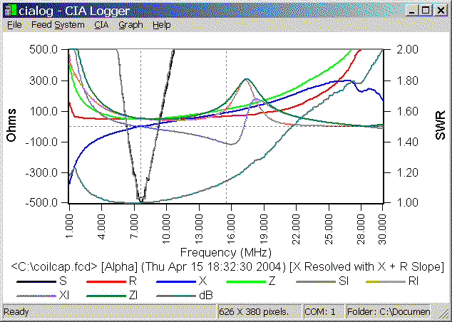
Here is a rather busy Single Data Set example graph, and an explanation of the legends visible on the graph.
 |
| Single Data Set Example Graph |
The left vertical axis has been assigned to Ohms units. The range of -500 to +500 Ohms is one of the predefined ranges. The SWR axis, on the right, has a predefined range of 2:1.
The horizontal axis is the frequency axis, and is labeled in MHz.
This data was loaded from a file, and the file name is the first item on the description line. The file name is C:\coilcap.fcd. The name is enclosed in widget characters to identify it as a file name. If the data was just captured, and not saved to a file, this this field would be missing. The next indicator, [Alpha], is the name of the feed system that was used at the time of the original data capture. If a feed system was not specified, this this field will not be shown. The date and time of the capture is enclosed in parenthesis. The description line ends with a specification of the reactance resolution mode. This field will be missing if no reactance resolution was performed.
The bottom portion of the graph matches trace color or style with data. For example, the black trace is the S data, which is SWR measured at the CIA-HF. All nine possible traces are shown in this example. The legend name codes are explained in the table in this section.
Here is an example Multiple Data Set graph.
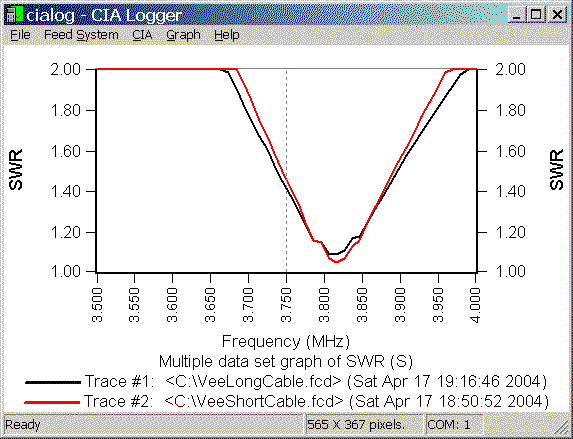 |
| Multiple Data Set Example Graph |
This example compares the SWR of an 80 meter Inverted Vee between two different measurements, each saved to a file. One case used a longer transmission line than the other, so we would expect to see a slight change in the SWR curve. The longer line version (trace #1) has a wider SWR response, due to additional loss on the cable.
Because this is Multiple Data Set Mode, only only type of measurement can be viewed at a time - in this case, SWR as measured at the CIA-HF. Each trace line identifies the drawing color or style (if black and white), as well as a description of the data set. This description matches the format of the Single Data Set graph, in terms of file name, feed system, capture date, and reactance resolution.
Last update:
Monday, October 18, 2004 04:32:29 PM
Back to the cialog Home Page